Options
All
  • Public
  • Public/Protected
  • All
Menu

Package graphiql

GraphiQL

Security Notice: All versions of graphiql < 1.4.3 are vulnerable to an XSS attack in cases where the GraphQL server to which the GraphiQL web app connects is not trusted. Learn more in our security advisory.

NPM jsDelivr hits (npm) npm downloads Snyk Vulnerabilities for npm package npm bundle size (version) npm bundle size (version) License

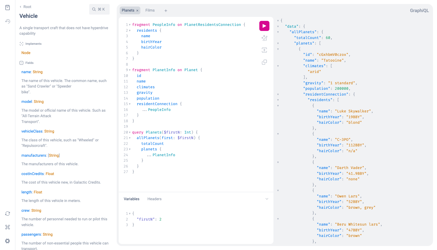
/ˈɡrafək(ə)l/ A graphical interactive in-browser GraphQL IDE. Try the live demo.

Features

  • Full language support of the latest GraphQL Specification:
  • Syntax highlighting
  • Intelligent type ahead of fields, arguments, types, and more
  • Real-time error highlighting and reporting for queries and variables
  • Automatic query and variables completion
  • Automatic leaf node insertion for non-scalar fields
  • Documentation explorer with search and markdown support
  • Persisted state using localStorage
  • Simple API for adding custom plugins

Live Demos

Examples

Getting started

If you're looking to upgrade from graphiql@1.x to graphiql@2, check out the migration guide!

UMD

With unpkg/jsdelivr, etc.:

<link href="https://unpkg.com/graphiql/graphiql.min.css" rel="stylesheet" />
<script crossorigin src="https://unpkg.com/graphiql/graphiql.min.js"></script>

(see: Usage UMD Bundle below for more required script tags)

Usage

Using as package

The graphiql package can be installed using your favorite package manager. You also need to have react,react-dom and graphql installed which are peer dependencies of graphiql.

npm install graphiql react react-dom graphql

The package exports a bunch of React components:

  • The GraphiQLProvider components renders multiple context providers that encapsulate all state management
  • The GraphiQLInterface component renders the UI that makes up GraphiQL
  • The GraphiQL component is a combination of both the above components

There is a single prop that is required for the GraphiQL component called fetcher. A fetcher is a function that performs a request to a GraphQL API. It may return a Promise for queries or mutations, but also an Observable or an AsyncIterable in order to handle subscriptions or multipart responses.

An easy way to get create such a function is the createGraphiQLFetcher method exported from the @graphiql/toolkit package. If you want to implement your own fetcher function you can use the Fetcher type from @graphiql/toolkit to make sure the signature matches what GraphiQL expects.

The following is everything you need to render GraphiQL in your React application:

import { createGraphiQLFetcher } from '@graphiql/toolkit';
import { GraphiQL } from 'graphiql';
import React from 'react';
import { createRoot } from 'react-dom/client';
import 'graphiql/graphiql.css';

const fetcher = createGraphiQLFetcher({ url: 'https://my.backend/graphql' });

const root = createRoot(document.getElementById('root'));
root.render(<GraphiQL fetcher={fetcher} />);

Using as UMD bundle over CDN (Unpkg, JSDelivr, etc)

There exist pre-bundled static assets that allow you to easily render GraphiQL just by putting together a single HTML file. Check out the index.html file in the example project in this repository.

Customize

GraphiQL supports customization in UI and behavior by accepting React props and children.

Props

For props documentation, see the API Docs

Children

Parts of the UI can be customized by passing children to the GraphiQL or the GraphiQLInterface component.

  • <GraphiQL.Logo>: Replace the GraphiQL logo with your own.

  • <GraphiQL.Toolbar>: Add a custom toolbar below the execution button. Pass the empty <GraphiQL.Toolbar /> if an empty toolbar is desired. Use the components provided by @graphiql/react to create toolbar buttons with proper styles.

  • <GraphiQL.Footer>: Add a custom footer shown below the response editor.

Plugins

Starting with graphiql@2 there exists a simple plugin API that allows you to build your own custom tools right into GraphiQL.

There are two built-in plugins that come with GraphiQL: The documentation explorer and the query history. Both can be toggled using icons in the sidebar on the left side of the screen. When opened, they appear next to the sidebar in a resizable portion of the screen.

To define your own plugin, all you need is a JavaScript object with three properties:

  • title: A unique title for the plugin (this will show up in a tooltip when hovering over the sidebar icon)
  • icon: A React component that renders an icon which will be included in the sidebar
  • content: A React component that renders the plugin contents which will be shown next to the sidebar when opening the plugin

You can pass a list of plugin objects to the GraphiQL component using the plugins prop. You can also control the visibility state of plugins using the visiblePlugin prop and react to changes of the plugin visibility state using the onTogglePluginVisibility prop.

Inside the component you pass to content you can interact with the GraphiQL state using the hooks provided by @graphiql/react. For example, check out how you can integrate the OneGraph Explorer in GraphiQL using the plugin API in the plugin package in this repo.

Theming

The GraphiQL interface uses CSS variables for theming, in particular for colors. Check out the root.css file for the available variables.

Overriding these variables is the only officially supported way of customizing the appearance of GraphiQL. Starting from version 2, class names are no longer be considered stable and might change between minor or patch version updates.

Editor Theme

The colors inside the editor can also be altered using CodeMirror editor themes. You can use the editorTheme prop to pass in the name of the theme. The CSS for the theme has to be loaded for the theme prop to work.

// In your document head:
<link
  rel="stylesheet"
  href="https://cdnjs.cloudflare.com/ajax/libs/codemirror/5.23.0/theme/solarized.css"
/>
// When rendering GraphiQL:
<GraphiQL editorTheme="solarized light" />

You can also create your own theme in CSS. As a reference, the default graphiql theme definition can be found here.

Index

References

GraphiQL

Re-exports GraphiQL

GraphiQLInterface

Re-exports GraphiQLInterface

GraphiQLInterfaceProps

Re-exports GraphiQLInterfaceProps

GraphiQLProps

Re-exports GraphiQLProps

GraphiQLProvider

Re-exports GraphiQLProvider

GraphiQLProviderProps

Re-exports GraphiQLProviderProps

default

Renames and re-exports GraphiQL

Type aliases

GraphiQLInterfaceProps

GraphiQLInterfaceProps: WriteableEditorProps & AddSuffix<Pick<UseQueryEditorArgs, "onEdit">, "Query"> & Pick<UseQueryEditorArgs, "onCopyQuery"> & AddSuffix<Pick<UseVariableEditorArgs, "onEdit">, "Variables"> & AddSuffix<Pick<UseHeaderEditorArgs, "onEdit">, "Headers"> & Pick<UseResponseEditorArgs, "responseTooltip"> & { children?: ReactNode; defaultEditorToolsVisibility?: boolean | "variables" | "headers"; disableTabs?: undefined | false | true; isHeadersEditorEnabled?: undefined | false | true; showPersistHeadersSettings?: undefined | false | true; toolbar?: GraphiQLToolbarConfig }

GraphiQLProps

GraphiQLProps: Omit<GraphiQLProviderProps, "children"> & GraphiQLInterfaceProps

GraphiQLToolbarConfig

GraphiQLToolbarConfig: { additionalComponent?: React.JSXElementConstructor<any>; additionalContent?: React.ReactNode }

Type declaration

  • Optional additionalComponent?: React.JSXElementConstructor<any>

    same as above, except a component with access to context

  • Optional additionalContent?: React.ReactNode

    This content will be rendered after the built-in buttons of the toolbar. Note that this will not apply if you provide a completely custom toolbar (by passing GraphiQL.Toolbar as child to the GraphiQL component).

Maybe

Maybe<T>: T | null | undefined

Type parameters

  • T

Op

Op: { headersString?: undefined | string; query: string; response?: Record<string, any>; variables?: Record<string, any>; variablesString?: undefined | string }

Type declaration

  • Optional headersString?: undefined | string
  • query: string
  • Optional response?: Record<string, any>
  • Optional variables?: Record<string, any>
  • Optional variablesString?: undefined | string

ReactComponentLike

ReactComponentLike: string | ((props: any, context?: any) => any) | {}

ReactElementLike

ReactElementLike: { key: string | number | null; props: any; type: ReactComponentLike }

Type declaration

ReactNodeLike

ReactNodeLike: {} | ReactElementLike | Array<ReactNodeLike> | string | number | boolean | null | undefined

Variables

Const DEFAULT_HEADERS

DEFAULT_HEADERS: "{"foo":2}" = "{"foo":2}"

Const mockBadQuery

mockBadQuery: "bad {} query" = "bad {} query"

Const mockHeaders1

mockHeaders1: string = JSON.stringify({ foo: 'bar' })

Const mockHeaders2

mockHeaders2: string = JSON.stringify({ foo: 'baz' })

Const mockHistoryLabel1

mockHistoryLabel1: "Test" = "Test"

Const mockOperationName1

mockOperationName1: "Test" = "Test"

Const mockOperationName2

mockOperationName2: "Test2" = "Test2"

Const mockQuery1

mockQuery1: "query Test($string: String) {test {hasArgs(string: $string)}}" = `query Test($string: String) {test {hasArgs(string: $string)}}`

Const mockQuery2

mockQuery2: "query Test2 {test {id}}" = `query Test2 {test {id}}`

Const mockVariables1

mockVariables1: string = JSON.stringify({ string: 'string' })

Const mockVariables2

mockVariables2: string = JSON.stringify({ string: 'string2' })

Const testQuery

testQuery: "{longDescriptionType {idimagehasArgstest {idisTest__typename}}}" = `{longDescriptionType {idimagehasArgstest {idisTest__typename}}}`

Functions

CodeMirror

  • CodeMirror(node: HTMLElement, __namedParameters: { options: options; value: any }): { emit: _emit; addKeyMap: any; getValue: any; off: any; on: any; refresh: any; removeKeyMap: any; setOption: any; setSize: any; setValue: any; options: object; state: object }

GraphiQL

  • GraphiQL(__namedParameters: { dangerouslyAssumeSchemaIsValid: undefined | false | true; defaultHeaders: undefined | string; defaultQuery: undefined | string; defaultTabs: undefined | TabDefinition[]; externalFragments: undefined | string | FragmentDefinitionNode[]; fetcher: Fetcher; getDefaultFieldNames: undefined | GetDefaultFieldNamesFn; headers: undefined | string; inputValueDeprecation: undefined | false | true; introspectionQueryName: undefined | string; maxHistoryLength: undefined | number; onEditOperationName: undefined | onEditOperationName; onSchemaChange: undefined | onSchemaChange; onTabChange: undefined | onTabChange; onTogglePluginVisibility: undefined | onTogglePluginVisibility; operationName: undefined | string; plugins: undefined | GraphiQLPlugin[]; props: props; query: undefined | string; response: undefined | string; schema: undefined | null | GraphQLSchema | IntrospectionQuery; schemaDescription: undefined | false | true; shouldPersistHeaders: undefined | false | true; storage: undefined | Storage; validationRules: undefined | ValidationRule[]; variables: undefined | string; visiblePlugin: undefined | string | GraphiQLPlugin }): Element
  • The top-level React component for GraphiQL, intended to encompass the entire browser viewport.

    see

    https://github.com/graphql/graphiql#usage

    Parameters

    • __namedParameters: { dangerouslyAssumeSchemaIsValid: undefined | false | true; defaultHeaders: undefined | string; defaultQuery: undefined | string; defaultTabs: undefined | TabDefinition[]; externalFragments: undefined | string | FragmentDefinitionNode[]; fetcher: Fetcher; getDefaultFieldNames: undefined | GetDefaultFieldNamesFn; headers: undefined | string; inputValueDeprecation: undefined | false | true; introspectionQueryName: undefined | string; maxHistoryLength: undefined | number; onEditOperationName: undefined | onEditOperationName; onSchemaChange: undefined | onSchemaChange; onTabChange: undefined | onTabChange; onTogglePluginVisibility: undefined | onTogglePluginVisibility; operationName: undefined | string; plugins: undefined | GraphiQLPlugin[]; props: props; query: undefined | string; response: undefined | string; schema: undefined | null | GraphQLSchema | IntrospectionQuery; schemaDescription: undefined | false | true; shouldPersistHeaders: undefined | false | true; storage: undefined | Storage; validationRules: undefined | ValidationRule[]; variables: undefined | string; visiblePlugin: undefined | string | GraphiQLPlugin }
      • dangerouslyAssumeSchemaIsValid: undefined | false | true
      • defaultHeaders: undefined | string
      • defaultQuery: undefined | string
      • defaultTabs: undefined | TabDefinition[]
      • externalFragments: undefined | string | FragmentDefinitionNode[]
      • fetcher: Fetcher
      • getDefaultFieldNames: undefined | GetDefaultFieldNamesFn
      • headers: undefined | string
      • inputValueDeprecation: undefined | false | true
      • introspectionQueryName: undefined | string
      • maxHistoryLength: undefined | number
      • onEditOperationName: undefined | onEditOperationName
      • onSchemaChange: undefined | onSchemaChange
      • onTabChange: undefined | onTabChange
      • onTogglePluginVisibility: undefined | onTogglePluginVisibility
      • operationName: undefined | string
      • plugins: undefined | GraphiQLPlugin[]
      • props: props
      • query: undefined | string
      • response: undefined | string
      • schema: undefined | null | GraphQLSchema | IntrospectionQuery
      • schemaDescription: undefined | false | true
      • shouldPersistHeaders: undefined | false | true
      • storage: undefined | Storage
      • validationRules: undefined | ValidationRule[]
      • variables: undefined | string
      • visiblePlugin: undefined | string | GraphiQLPlugin

    Returns Element

GraphiQLInterface

codeWithLineNumbers

  • codeWithLineNumbers(code: string): string

normalize

  • normalize(str: string): string

normalizeWhitespace

  • normalizeWhitespace(str: string): string

Object literals

Const mockSuccess

mockSuccess: object

data

data: object

longDescriptionType

longDescriptionType: object

hasArgs

hasArgs: string = "{"defaultValue":"test default value"}"

id

id: string = "abc123"

image

image: string = "/images/logo.svg"

test

test: object

__typename

__typename: string = "Test"

id

id: string = "abc123"

isTest

isTest: boolean = true

Generated using TypeDoc